

In today's world, having a future-proof website is very important. It helps businesses stay ahead. With new devices and how people use them, using effective web design techniques is essential. It makes sure everyone has a good experience, no matter the device.
We're going to look at responsive web design and its future. We'll see what's new and what's coming. This way, businesses can keep up and give users the best experience.
Key Takeaways
- Understanding the importance of responsive web design in 2025
- Exploring the latest trends and techniques in web design
- Learning how to provide a seamless user experience across devices
- Discovering future-proof web design techniques
- Staying ahead of the curve in web development
The Evolution of Responsive Web Design
Responsive web design has changed a lot over the years. At first, it was all about making websites work on different screens. This was the start of making websites better for everyone.
From Mobile-First to Device-Agnostic Approaches
Historical Perspective: 2010-2024
In the early 2010s, making websites for mobile phones became important. This was because more people were using phones to go online than computers.
The Shift to Universal Design Principles
As new devices came out, designers started making websites for all devices. This made websites work better on many screens, making things easier for users.
Key Shifts in User Behavior and Expectations
Multi-Device Usage Patterns
Now, people use websites on many devices, like phones and TVs. Designers need to know how people use these devices to make good websites.
Attention Spans and Content Consumption
With so much online content, people don't focus as long as they used to. Websites need to be clear and easy to read to keep users interested.
| Year | Design Approach | User Behavior |
|---|---|---|
| 2010 | Desktop-First | Primarily desktop internet usage |
| 2015 | Mobile-First | Mobile internet usage surpasses desktop |
| 2024 | Device-Agnostic | Multi-device usage becomes the norm |
The way responsive web design has changed shows how technology and user habits keep evolving. By making websites for all devices and focusing on user experience, developers can make websites that work well for everyone, now and in the future.
Understanding the 2025 Digital Landscape
The digital world is getting ready for a big change in 2025. Foldable displays and ambient computing are leading the way. These changes are coming from new devices and screens that change how we use them.
Emerging Device Categories and Screen Formats
New devices are making the digital world bigger. Two big trends are:
Foldable and Flexible Displays
Foldable and flexible screens are changing how we use devices. They make devices easier to carry and offer new ways to see things. For example, a foldable phone can be big when you need it, but small when you don't.
Ambient Computing Interfaces
Ambient computing is making technology easier to use. It makes tech blend into our world, giving us a smooth experience.
Impact of AI and Voice Interfaces on Web Design
AI and voice interfaces are changing web design. Voice-activated sites are becoming more common. This means we need designs that are easy to talk to. AI also makes sites more personal by showing content we like.
Global Connectivity Trends Affecting Design Decisions
Global trends are shaping web design. We focus on making sites work well everywhere. This means fast sites and designs that work for everyone.
| Trend | Impact on Web Design | Key Considerations |
|---|---|---|
| Emerging Device Categories | New interaction paradigms | Flexibility, Adaptability |
| AI and Voice Interfaces | Conversational design | Accessibility, Personalization |
| Global Connectivity | Performance optimization | Speed, Reliability |
Core Principles of Responsive Web Design: Best Practices for 2025
Understanding responsive web design is key for developers today. The digital world keeps changing. Users interact with websites in many ways now.
Fluid Grids and Flexible Layouts
Fluid grids and flexible layouts are at the heart of responsive web design. They help websites fit any screen size or device.
Advanced CSS Grid Implementations
CSS Grid has changed how we make responsive layouts. It lets developers build strong, flexible grids for all screen sizes.
Subgrid and Layout Algorithms
Subgrid and layout algorithms have made CSS Grid even better. They help control nested grid items. This makes creating complex designs easier.
Adaptive Images and Media
Adaptive images and media are key for responsive design. They make websites load faster and work better on all devices.
Next-Gen Format Selection
Picking the right image and media formats is important. Formats like WebP and AVIF are great for responsive design because they save space without losing quality.
Context-Aware Media Loading
Media loads differently based on the device and network. This makes websites work better for everyone, no matter where they are.
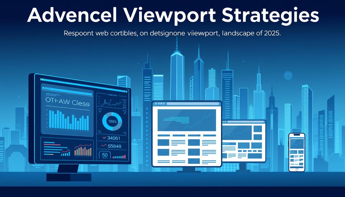
Advanced Viewport Strategies
In 2025, web design is getting a big update. We're seeing new ways to make websites work better on all kinds of devices. This means websites will look great on phones, tablets, and computers.
Beyond Traditional Breakpoints
Old ways of making websites work on different screens aren't enough anymore. Now, we need to think about all sorts of devices and sizes. This makes websites better for everyone.
Feature-Based Media Queries
Media queries are changing how we design websites. Instead of just looking at screen size, we focus on what devices can do. This makes websites more personal and fun to use.
Dynamic Breakpoint Systems
Dynamic systems let designers change how websites look based on what's inside. It's not just about the screen size anymore. It's about what the website needs to show.
Container Queries and Element Queries
Container and element queries are new tools for web design. They let designers change how things look based on their container's size. This makes websites more flexible and fun.
Smashing Magazine says, "Container queries help make components that work well in many places and layouts."
Viewport-Based Typography Systems
Typography systems based on the viewport make text look good on all screens. This means text is easy to read and looks nice on phones, tablets, and computers.
Fluid Typography Implementations
Fluid typography uses special units to make text change size smoothly. This makes websites look better on all screens, giving a better experience.
| Typography Approach | Description | Benefits |
|---|---|---|
| Fluid Typography | Uses viewport units to scale text | Smooth scaling, cohesive experience |
| Variable Fonts | Utilizes font variations for flexibility | High customization, performance benefits |
Variable Fonts Optimization
Variable fonts are great for making websites look good and work well. Choosing the right fonts and using them right is key.
By using these new strategies, web designers can make websites that are easy to use and fun. This is important as technology keeps changing.
SEO-Friendly Responsive Design Techniques
SEO is key in making websites seen and used by everyone. It's important to use SEO-friendly ways in web design. These ways make websites better for users and help them rank higher in search engines.
Core Web Vitals Optimization for All Devices
Improving Core Web Vitals is vital for a smooth user experience on all devices. Focus on Largest Contentful Paint (LCP), First Input Delay (FID), and Cumulative Layout Shift (CLS).
LCP, FID, and CLS Across Viewports
It's important to check and improve these metrics on different devices. For example, keep LCP under 2.5 seconds, FID under 100 milliseconds, and CLS under 0.1. This makes websites better for users.
| Metric | Desktop Threshold | Mobile Threshold |
|---|---|---|
| LCP | 2.5 seconds | 2.5 seconds |
| FID | 100 ms | 100 ms |
| CLS | 0.1 | 0.1 |
Mobile vs. Desktop Performance Parity
It's important for websites to work well on both mobile and desktop. Make sure your website loads fast and works well on both.
Structured Data for Responsive Content
Using structured data helps search engines understand your website. This is very important for websites that change based on the device used.
Mobile-First Indexing Best Practices
Mobile-first indexing is now the standard. Make sure your website works well on mobile devices. Use technical SEO strategies to help.
Content Parity Strategies
Content parity means your mobile site should have the same content as your desktop site. This keeps your SEO rankings up and gives users a consistent experience.
Technical SEO for Responsive Sites
Technical SEO makes your website more visible and ranked higher on search engines. For responsive sites, make sure it's crawlable, indexable, and loads fast.
Performance Optimization for Fast Loading Times
Fast websites are now more important than ever. We need our sites to load quickly on all devices. This makes the user experience better.
Responsive Asset Delivery Strategies
Delivering assets in a way that works for all devices is key. We use adaptive loading patterns to do this. For example, we send smaller images to mobile users to speed up loading.

Adaptive Loading Patterns
Adaptive loading means giving different assets to different devices. We send WebP images to browsers that support them. We also use different video codecs for different devices.
Device-Specific Optimizations
Optimizing for each device can make websites faster. Mobiles get lower quality images and videos. Desktops get better quality.
JavaScript Performance for Responsive Interfaces
JavaScript is important for responsive sites, but it can slow them down. We use component-level code splitting to fix this. This loads only the JavaScript needed for the current page.
Component-Level Code Splitting
This method breaks down JavaScript into smaller parts. These parts load only when needed. It's great for big sites with lots of pages.
Viewport-Aware Script Loading
Scripts load faster when they match the user's screen. For example, scripts for a specific part of the site load only when that part is seen.
Server-Side Rendering vs. Client-Side Rendering
There's a debate between server-side rendering (SSR) and client-side rendering (CSR). SSR is fast at first, but CSR updates better without reloading.
Hybrid Rendering Approaches
Hybrid methods mix SSR and CSR. They aim to be fast at first and update well without reloading.
Edge Computing for Responsive Sites
Edge computing makes websites faster by reducing latency. It's great for responsive sites, making content adjust to the user's needs.
| Rendering Method | Initial Load Time | Dynamic Updates |
|---|---|---|
| Server-Side Rendering (SSR) | Fast | Limited |
| Client-Side Rendering (CSR) | Slower | Dynamic |
| Hybrid Rendering | Fast | Dynamic |
Accessibility as a Cornerstone of Responsive Design
Responsive design is more than just fitting different screen sizes. It's about making your website available to everyone. This means making sure it works for people with all kinds of abilities.
WCAG 3.0 Implementation Strategies
Following the latest Web Content Accessibility Guidelines (WCAG 3.0) is key. This means making sure your site is easy for everyone to use. Here are a few ways to do this:
- Make sure all interactive parts can be used with a keyboard.
- Use ARIA attributes to make dynamic content more accessible.
Device-Specific Accessibility Considerations
Each device has its own challenges for accessibility. Touch devices need special attention, unlike those using mice or keyboards.
Automated Accessibility Testing
Using automated tools can find problems early. This makes making your site more accessible easier.
Inclusive Design Patterns for All Devices
Designing for everyone is key. This means thinking about color blindness, providing text for images, and making layouts flexible.
Assistive Technology Compatibility
It's important to work well with tools like screen readers. This means:
Screen Reader Optimization
Make your site easy for screen readers by using clear headings and text for images.
Input Method Adaptations
Make your site work with different ways of input, like voice commands and switch controls. This makes it more accessible.
By using these strategies, you can make your website more accessible. This means a better experience for all visitors.
Dynamic Content Optimization Strategies
Dynamic content optimization changes how websites meet different user needs and devices. Web developers use new strategies to make websites better for users.
Adaptive Content Hierarchies
Adaptive content hierarchies are key for websites that change with the user's device. They make content easy to adjust for any screen size.
Priority-Based Content Display
Priority-based content shows the most important info first, no matter the device. Algorithms help decide what to show based on how users act.
Progressive Disclosure Techniques
Progressive disclosure shows content little by little. It doesn't dump too much info at once. This makes websites easier to use.
Micro-Content for Multi-Device Consumption
Micro-content is small, easy pieces of content for all devices. It's great for quick info, making websites fast and easy to use.
Personalization in Responsive Contexts
Personalization is big in responsive web design. It lets websites change for each user's likes and actions.
Device-Specific User Experiences
Device-specific experiences make websites fit the device being used. This makes users happier and more engaged.
Contextual Content Delivery
Contextual content delivery goes further by using the user's location or time. It shows content that's just right for them.
Testing and Quality Assurance for Future-Proof Web Design
The digital world is always changing. We need to test our websites a lot. This makes sure they work well on many devices.
Future-proof web design techniques need good testing. We use automated cross-device testing frameworks to find and fix problems early.
Automated Cross-Device Testing Frameworks
Testing tools are key for responsive designs. They check how websites work on different devices and sizes.
Visual Regression Testing
This testing checks how a website looks on different devices. It finds any changes or bugs. This keeps the website looking good everywhere.
Performance Testing Across Devices
Performance testing checks how fast a website loads on different devices. It finds slow spots and makes the website faster.
User Testing Methodologies for Responsive Designs
User testing shows how real people use a website. It finds problems and makes the website better for everyone.
Continuous Integration for Responsive Workflows
Continuous integration keeps responsive design quality high. It checks code changes often and runs tests to find errors early.
Device Lab Management
Managing a device lab is important. It tests websites on many devices, including old ones. This finds and fixes problems.
Responsive Design System Maintenance
Keeping a responsive design system up-to-date is hard work. It needs regular checks to stay current with new trends and technologies.
Conclusion: Preparing for the Next Generation of Web Experiences
As we look to 2025, making websites responsive is key. This means using fluid grids and flexible layouts. It also means using adaptive images.
These steps help websites work well on all devices and sizes. It's important for a great web experience.
Staying ahead in web design is vital. New tech like AI and voice interfaces are coming. Designers must be ready.
By following this guide, businesses and developers can get ready. They'll make sure their websites are up-to-date and easy to use.
Using new design techniques is important. This includes container queries and dynamic content. It helps websites adapt to changing user needs.
This way, businesses can keep up with the fast-changing digital world. They'll stay ahead of the competition.
FAQ
What are the key elements of a responsive web design?
A responsive web design uses fluid grids and flexible images. It also uses media queries. This makes a website work well on different screens and devices.
How does responsive web design impact SEO?
Responsive web design helps SEO a lot. It lets search engines see one website on all devices. This makes the website easier to find and rank higher.
What is the difference between mobile-first and device-agnostic design approaches?
Mobile-first design focuses on small screens first. Device-agnostic design works on all devices without favoring one. It's about flexibility and adaptability.
How can I optimize images for responsive web design?
To optimize images, use compression and lazy loading. Choose formats like WebP. Also, make images adapt to screen size and device.
What are the benefits of using container queries in responsive web design?
Container queries let developers style based on parent container size. This makes design more flexible and modular. It's great for reuse.
How can I ensure my website is accessible on various devices?
To make your website accessible, follow WCAG guidelines. Use semantic HTML and provide image alt text. Test with screen readers and consider device-specific needs.
What role does page speed play in responsive web design?
Page speed is very important. Faster sites keep users happy and engaged. Search engines also like fast sites more.
How can I test my website's responsiveness across different devices?
To test responsiveness, use browser tools and online testers. Try different devices and sizes. Also, do user testing to find real issues.
What are some best practices for dynamic content optimization in responsive web design?
For dynamic content, use adaptive hierarchies and prioritize content. Use progressive disclosure and personalize content. This makes content better for users.
How can I future-proof my website against emerging technologies and devices?
To future-proof, use flexible design and stay updated with trends. Use modular code that's easy to update. This keeps your site ready for new things.
Stay Updated on Web Design Trends
Subscribe to our newsletter to receive the latest insights on responsive web design, accessibility, and future-proof development techniques.
We respect your privacy. Unsubscribe at any time.
Additional Resources
Free Responsive Design Checklist
Download our comprehensive checklist to ensure your website meets all responsive design best practices.
Download ChecklistAuthor's Note
"Responsive web design is no longer optional in 2025. As devices continue to evolve, our approach to web design must evolve alongside them. The techniques outlined in this article represent the foundation of future-proof web development, ensuring your digital presence remains effective regardless of how users choose to interact with it."
— Ottster Digital Team